User Interface
To the Camera UI, you can add as many text and graphic elements as needed.
Usage
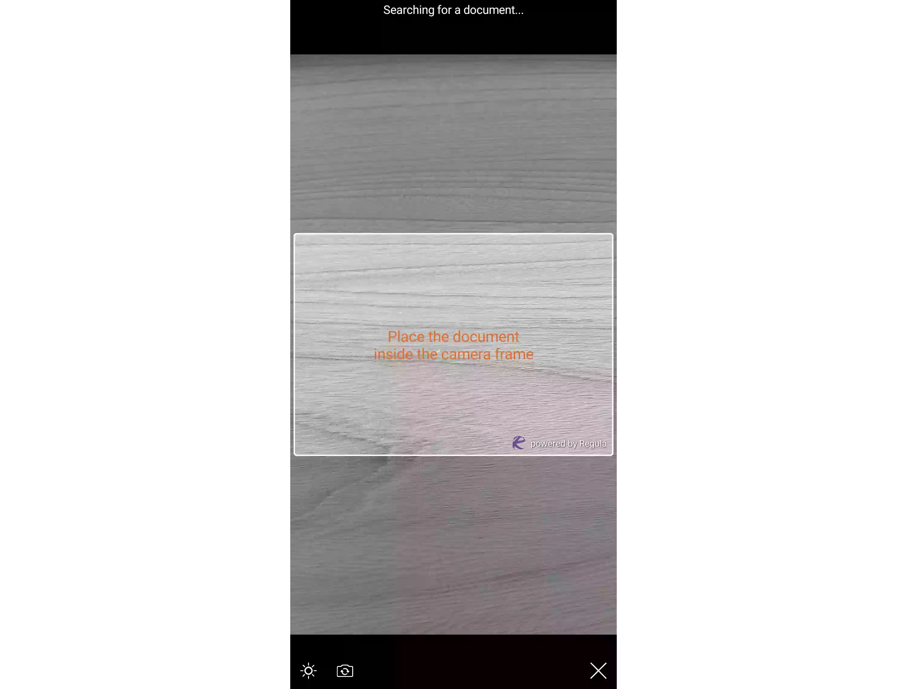
let jsonString = "{ \"objects\": [ { \"label\": { \"text\": \"Place the document\\ninside the camera frame\", \"position\": { \"h\": 1.0, \"v\": 0.55 }, \"background\": \"#00FFFFFF\", \"fontColor\": \"#FFEB6517\", \"fontSize\": 18, \"alignment\": \"center\" } } ] }"

if let data = jsonString.data(using: String.Encoding.utf8) {
    do {
        let json = try JSONSerialization.jsonObject(with: data, options: .mutableContainers) as? [String:Any]
        DocReader.shared.customization.customUILayerJSON = json
    } catch {
        print("Something went wrong")
    }
}
NSString * jsonString = @"{ \"objects\": [ { \"label\": { \"text\": \"Place the document\\ninside the camera frame\", \"position\": { \"h\": 1.0, \"v\": 0.55 }, \"background\": \"#00FFFFFF\", \"fontColor\": \"#FFEB6517\", \"fontSize\": 18, \"alignment\": \"center\" } } ] }";

NSData *data = [jsonString dataUsingEncoding:kCFStringEncodingUTF8];
if (data) {
  NSError *error;
  NSDictionary *json = [NSJSONSerialization JSONObjectWithData:data options:NSJSONReadingMutableContainers error:&error];
  if (!error) {
    RGLDocReader.shared.customization.customUILayerJSON = json;
  } else {
    NSLog(@"%@", error.localizedDescription);
  }
}
String jsonString = "{ \"objects\": [ { \"label\": { \"text\": \"Place the document\\ninside the camera frame\", \"position\": { \"h\": 1.0, \"v\": 0.55 }, \"background\": \"#00FFFFFF\", \"fontColor\": \"#FFEB6517\", \"fontSize\": 18, \"alignment\": \"center\" } } ] }";
JSONObject jsonObject = new JSONObject(jsonString);
DocumentReader.Instance().customization().edit().setUiCustomizationLayer(jsonObject).apply();
DocumentReader.instance.customization.uiCustomizationLayer = {
  "objects": [
    {
      "label": {
        "text": "Place the document\ninside the camera frame",
        "position": {"h": 1.0, "v": 0.55},
        "background": "#00FFFFFF",
        "fontColor": "#FFEB6517",
        "fontSize": 18,
        "alignment": "center"
      }
    }
  ]
};
DocumentReader.instance.customization.uiCustomizationLayer = {
  "objects": [
    {
      "label": {
        "text": "Place the document\ninside the camera frame",
        "position": { "h": 1.0, "v": 0.55 },
        "background": "#00FFFFFF",
        "fontColor": "#FFEB6517",
        "fontSize": 18,
        "alignment": "center"
      }
    }
  ]
}
// Android
DocumentReader.Instance().Customization().Edit().SetUiCustomizationLayer(new Org.Json.JSONObject("{ \"objects\": [ { \"label\": { \"text\": \"Place the document\\ninside the camera frame\", \"position\": { \"h\": 1.0, \"v\": 0.55 }, \"background\": \"#00FFFFFF\", \"fontColor\": \"#FFEB6517\", \"fontSize\": 18, \"alignment\": \"center\" } } ] }")).Apply();

// iOS
var jsonString = "{ \"objects\": [ { \"label\": { \"text\": \"Place the document\\ninside the camera frame\", \"position\": { \"h\": 1.0, \"v\": 0.55 }, \"background\": \"#00FFFFFF\", \"fontColor\": \"#FFEB6517\", \"fontSize\": 18, \"alignment\": \"center\" } } ] }";
NSError err;
NSData data = NSData.FromString(jsonString);
NSDictionary json = (NSDictionary)NSJsonSerialization.Deserialize(data, NSJsonReadingOptions.MutableContainers, out err);
RGLDocReader.Shared.Customization.CustomUILayerJSON = json;
DocumentReader.setCustomization({
      uiCustomizationLayer: {
        "objects": [
          {
            "label": {
              "text": "Place the document\ninside the camera frame",
              "position": {"h": 1.0, "v": 0.55},
              "background": "#00FFFFFF",
              "fontColor": "#FFEB6517",
              "fontSize": 18,
              "alignment": "center"
            }
          }
        ]
    },
}, (str) => { console.log(str) }, (error) => { console.log(error) });
DocumentReader.setCustomization({
      uiCustomizationLayer: {
        "objects": [
          {
            "label": {
              "text": "Place the document\ninside the camera frame",
              "position": {"h": 1.0, "v": 0.55},
              "background": "#00FFFFFF",
              "fontColor": "#FFEB6517",
              "fontSize": 18,
              "alignment": "center"
            }
          }
        ]
    }
});
DocumentReader.setCustomization({
      uiCustomizationLayer: {
        "objects": [
          {
            "label": {
              "text": "Place the document\ninside the camera frame",
              "position": {"h": 1.0, "v": 0.55},
              "background": "#00FFFFFF",
              "fontColor": "#FFEB6517",
              "fontSize": 18,
              "alignment": "center"
            }
          }
        ]
    },
}, function (m) { }, function (e) { console.log(e); });
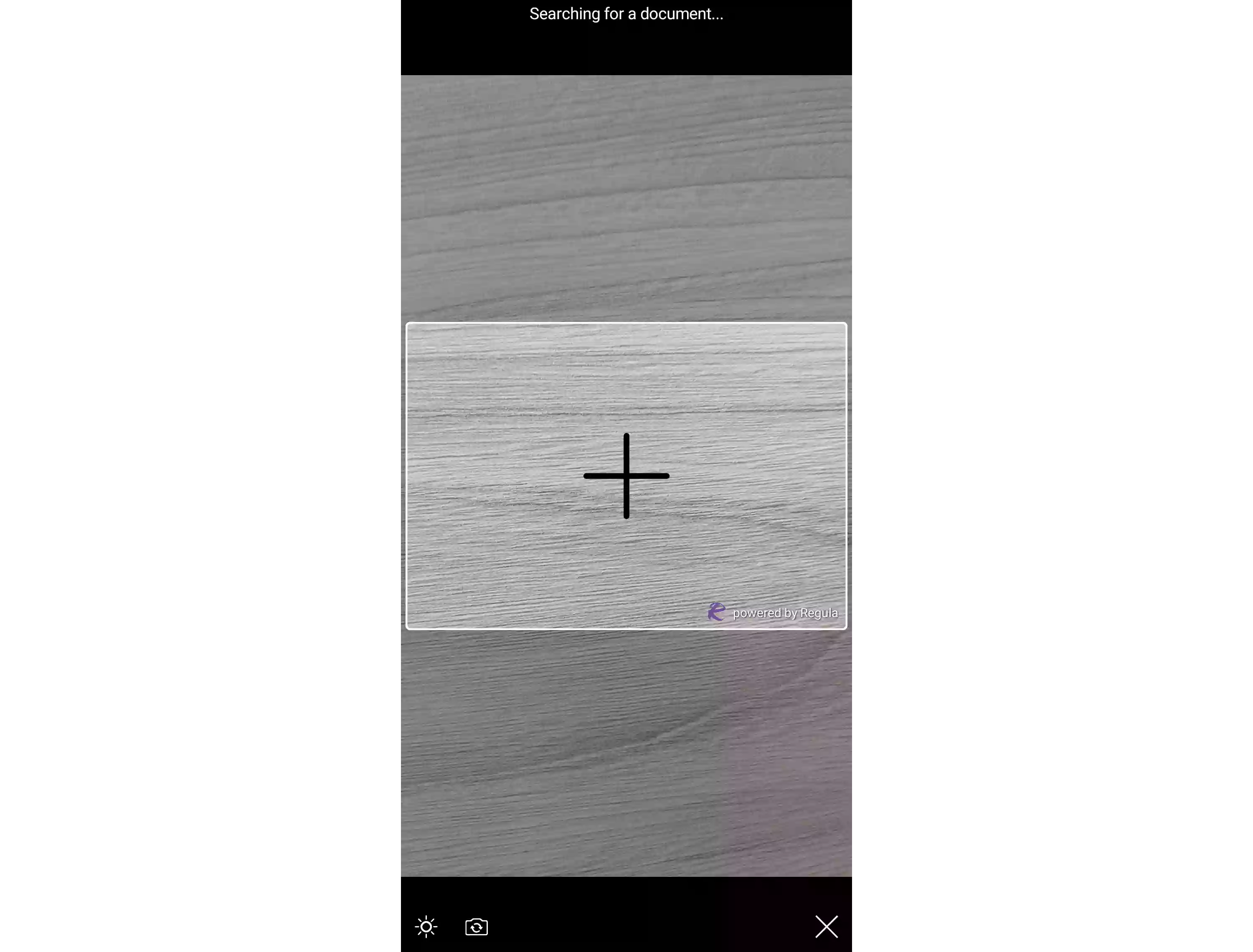
let jsonString = "{ \"objects\": [ { \"label\": { \"text\": \"Place the document\\ninside the camera frame\", \"position\": { \"h\": 1.0, \"v\": 1.0 }, \"background\": \"#00FFFFFF\", \"fontColor\": \"#FFEB6517\", \"fontSize\": 18, \"alignment\": \"center\" } } ] }"

if let data = jsonString.data(using: String.Encoding.utf8) {
    do {
        let json = try JSONSerialization.jsonObject(with: data, options: .mutableContainers) as? [String:Any]
        DocReader.shared.customization.customUILayerJSON = json
    } catch {
        print("Something went wrong")
    }
}
NSString * jsonString = @"{ \"objects\": [ { \"label\": { \"text\": \"Place the document\\ninside the camera frame\", \"position\": { \"h\": 1.0, \"v\": 1.0 }, \"background\": \"#00FFFFFF\", \"fontColor\": \"#FFEB6517\", \"fontSize\": 18, \"alignment\": \"center\" } } ] }";

NSData *data = [jsonString dataUsingEncoding:kCFStringEncodingUTF8];
if (data) {
  NSError *error;
  NSDictionary *json = [NSJSONSerialization JSONObjectWithData:data options:NSJSONReadingMutableContainers error:&error];
  if (!error) {
    RGLDocReader.shared.customization.customUILayerJSON = json;
  } else {
    NSLog(@"%@", error.localizedDescription);
  }
}
String jsonString = "{ \"objects\": [ { \"label\": { \"text\": \"Place the document\\ninside the camera frame\", \"position\": { \"h\": 1.0, \"v\": 1.0 }, \"background\": \"#00FFFFFF\", \"fontColor\": \"#FFEB6517\", \"fontSize\": 18, \"alignment\": \"center\" } } ] }";
JSONObject jsonObject = new JSONObject(jsonString);
DocumentReader.Instance().customization().edit().setUiCustomizationLayer(jsonObject).apply();
DocumentReader.instance.customization.uiCustomizationLayer = {
  "objects": [
    {
      "label": {
        "text": "Place the document\ninside the camera frame",
        "position": {"h": 1.0, "v": 1.0},
        "background": "#00FFFFFF",
        "fontColor": "#FFEB6517",
        "fontSize": 18,
        "alignment": "center"
      }
    }
  ]
};
DocumentReader.instance.customization.uiCustomizationLayer = {
  "objects": [
    {
      "label": {
        "text": "Place the document\ninside the camera frame",
        "position": { "h": 1.0, "v": 1.0 },
        "background": "#00FFFFFF",
        "fontColor": "#FFEB6517",
        "fontSize": 18,
        "alignment": "center"
      }
    }
  ]
}
// Android
DocumentReader.Instance().Customization().Edit().SetUiCustomizationLayer(new Org.Json.JSONObject("{ \"objects\": [ { \"label\": { \"text\": \"Place the document\\ninside the camera frame\", \"position\": { \"h\": 1.0, \"v\": 1.0 }, \"background\": \"#00FFFFFF\", \"fontColor\": \"#FFEB6517\", \"fontSize\": 18, \"alignment\": \"center\" } } ] }")).Apply();

// iOS
var jsonString = "{ \"objects\": [ { \"label\": { \"text\": \"Place the document\\ninside the camera frame\", \"position\": { \"h\": 1.0, \"v\": 1.0 }, \"background\": \"#00FFFFFF\", \"fontColor\": \"#FFEB6517\", \"fontSize\": 18, \"alignment\": \"center\" } } ] }";
NSError err;
NSData data = NSData.FromString(jsonString);
NSDictionary json = (NSDictionary)NSJsonSerialization.Deserialize(data, NSJsonReadingOptions.MutableContainers, out err);
RGLDocReader.Shared.Customization.CustomUILayerJSON = json;
DocumentReader.setCustomization({
      uiCustomizationLayer: {
        "objects": [
          {
            "label": {
              "text": "Place the document\ninside the camera frame",
              "position": {"h": 1.0, "v": 1.0},
              "background": "#00FFFFFF",
              "fontColor": "#FFEB6517",
              "fontSize": 18,
              "alignment": "center"
            }
          }
        ]
    },
}, (str) => { console.log(str) }, (error) => { console.log(error) });
DocumentReader.setCustomization({
      uiCustomizationLayer: {
        "objects": [
          {
            "label": {
              "text": "Place the document\ninside the camera frame",
              "position": {"h": 1.0, "v": 1.0},
              "background": "#00FFFFFF",
              "fontColor": "#FFEB6517",
              "fontSize": 18,
              "alignment": "center"
            }
          }
        ]
    }
});
DocumentReader.setCustomization({
      uiCustomizationLayer: {
        "objects": [
          {
            "label": {
              "text": "Place the document\ninside the camera frame",
              "position": {"h": 1.0, "v": 1.0},
              "background": "#00FFFFFF",
              "fontColor": "#FFEB6517",
              "fontSize": 18,
              "alignment": "center"
            }
          }
        ]
    },
}, function (m) { }, function (e) { console.log(e); });
Examples


JSON Structure
For the JSON with all possible params, see the sample file.
objects
└── label
└── image
└── button
| Name | Description |
|---|---|
label |
Text elements |
image |
Graphic elements |
button |
Buttons |
Label
Adds text elements to the UI.
label
└── text
└── fontStyle
└── fontColor
└── fontSize
└── fontName
└── alignment
└── background
└── borderRadius
└── padding
|   └── start
|   └── end
|   └── left
|   └── right
|   └── top
|   └── bottom
└── margin
|   └── start
|   └── end
|   └── left
|   └── right
|   └── top
|   └── bottom
└── size
|   └── width
|   └── height
└── alpha
└── position
|   └── h
|   └── v
└── backLayer
| Name | Description |
|---|---|
text |
Text. |
fontStyle |
Defines whether a font should be styled with a normal, italic, or bold face. Possible values:
|
fontColor |
Font color, hex. |
fontSize |
Font size, sp. |
fontName |
Font name. |
alignment |
Defines how text aligns in the space it appears:
|
background |
Background color, hex. |
borderRadius |
Defines the radius of the element's corners, lets you add rounded corners to elements. |
padding |
The space between an element's border and the element's content. |
margin |
The space around an element's border. |
size |
Size:
|
alpha |
The alpha channel value, represents transparency or opacity of a color for each pixel. Can be any value between 0 and 1, where 0 is for full transparency and 1 is for full opacity. |
position |
Position:
The value should be in a range from 0 to 2. |
backLayer |
An optional feature for images and labels. By setting it to 1, you can position the image/text behind a mask. If the field is missing from the JSON or set to any value other than 1, the text/image will be drawn in the foreground. |
Warning
If both position and margin are used, position has the priority.
Image
Adds graphic elements to the UI.
image
└── data
└── name
└── contentDescription
└── background
└── borderRadius
└── contentMode
└── padding
|   └── start
|   └── end
|   └── left
|   └── right
|   └── top
|   └── bottom
└── margin
|   └── start
|   └── end
|   └── left
|   └── right
|   └── top
|   └── bottom
└── size
|   └── width
|   └── height
└── alpha
└── position
|   └── h
|   └── v
└── backLayer
| Name | Description |
|---|---|
data |
Image in the Base64 format. |
name |
File name (the file is taken from the drawable folder). |
contentDescription |
An accessibility label that describes the purpose of the image for screen readers. (Android-only) |
background |
Background color, hex. |
borderRadius |
Defines the radius of the element's corners, lets you add rounded corners to elements. |
contentMode |
Defines how a view adjusts its content when its size changes:
|
padding |
The space between an element's border and the element's content. |
margin |
The space around an element's border. |
size |
Size:
|
alpha |
The alpha channel value, represents transparency or opacity of a color for each pixel. Can be any value between 0 and 1, where 0 is for full transparency and 1 is for full opacity. |
position |
Position:
The value should be in a range from 0 to 2. |
backLayer |
An optional feature for images and labels. By setting it to 1, you can position the image/text behind a mask. If the field is missing from the JSON or set to any value other than 1, the text/image will be drawn in the foreground. |
Button
Adds custom buttons to the interface.
button
└── title
└── contentDescription
└── tag
└── alpha
└── backLayer
└── style
└── fontStyle
└── fontColor
└── background
└── fontSize
└── fontName
└── alignment
└── enabled
└── borderRadius
└── padding
|   └── start
|   └── end
|   └── top
|   └── bottom
└── margin
|   └── start
|   └── end
|   └── left
|   └── right
|   └── top
|   └── bottom
└── position
|   └── h
|   └── v
└── image
|   └── data
|   └── name
|   └── placement
|   └── padding
| Name | Description |
|---|---|
title |
The text on the button. |
contentDescription |
An accessibility label that describes the purpose of the button for screen readers. |
tag |
Button identifier. |
alpha |
The alpha channel value, represents transparency or opacity of a color for each pixel. Can be any value between 0 and 1, where 0 is for full transparency and 1 is for full opacity. |
backLayer |
An optional feature for images and labels. By setting it to 1, you can position the image/text behind a mask. If the field is missing from the JSON or set to any value other than 1, the text/image will be drawn in the foreground. |
style |
The name of the style from the resources. |
fontStyle |
Defines whether a font should be styled with a normal, italic, or bold face. Possible values:
|
fontColor |
Font color, hex. |
background |
Background color, hex. |
fontSize |
Font size, sp. |
fontName |
Font name. |
alignment |
Defines how text aligns in the space it appears:
|
enabled |
Whether to enable the button, bool. |
borderRadius |
Defines the radius of the element's corners, lets you add rounded corners to elements. |
padding |
The indent from the text inside the button to the borders of the button. |
margin |
The space around the buttons's border. |
position |
Position:
The value should be in a range from 0 to 2. |
image |
The added to the button image data:
|
To set a button callback, invoke:
DocReader.shared.customization.actionDelegate = self

extension ViewController: DocReader.CustomizationActionDelegate {
    func onCustomButtonTapped(withTag tag: Int) {
        print("Button with tag = \(tag) tapped.")
    }
}
RGLDocReader.shared.customization.actionDelegate = self;

- (void)onCustomButtonTappedWithTag:(NSInteger)tag {

}
DocumentReader.Instance().setOnClickListener { view ->
    if(view.tag == 102) {
        clickAction()
    }
}
DocumentReader.Instance().setOnClickListener(new View.OnClickListener() {
    @Override
    public void onClick(View view) {
        if ((int)view.getTag() == 102) {
            clickAction();
        }
    }
});
DocumentReader.instance.onCustomButtonTapped = (tag) {
  if (tag == 102) {
    clickAction();
  }
};
eventManager.addListener('onCustomButtonTappedEvent', tag => {
  if (tag['msg'] == 102) {
    this.clickAction();
  }
})
// Android
public class MainActivity : MauiAppCompatActivity, Android.Views.View.IOnClickListener
{
    protected override void OnCreate(Bundle bundle)
    {
        DocumentReader.Instance().SetOnClickListener(this);
    }

    public void OnClick(Android.Views.View view)
    {
        if ((int)view.Tag == 102)
        {
            // do something
        }
    }
}


// iOS
public class MyClass : RGLCustomizationActionDelegate
{
    public MyClass()
    {
        RGLDocReader.Shared.Customization.ActionDelegate = this;
    }

    public override void OnCustomButtonTappedWithTag(nint tag){

    }
}