Accessibility in Document Reader SDK
Regula makes the user interfaces provided by the Document Reader SDK accessible and inclusive for a wide range of users, including those who rely on assistive technologies. The built-in interfaces are designed to follow WCAG 2.1 guidelines.
If you customize the built-in interface or implement your own, the accessibility of the result depends on your choices. This page explains which guidelines apply, which screen readers the SDK aims to support, and what to check when you customize the UI.
WCAG 2.1 Overview
WCAG 2.1 is a set of guidelines for making content more accessible. These guidelines are published by the World Wide Web Consortium (W3C), an organization that develops standards for the web. WCAG 2.1 groups its success criteria under four principles:
| Principle | Description |
|---|---|
| Perceivable | Present information and user interface components in ways that users can perceive (using sight, hearing, or touch). |
| Operable | Make user interface components and navigation operable, regardless of how they input commands. |
| Understandable | Make information and the operation of user interfaces understandable. |
| Robust | Make content interpretable by user agents, including assistive technologies. |
Screen Reader Support
Document Reader SDK is intended to work with the following screen readers:
- Native screen readers of supported browsers and devices, including VoiceOver and TalkBack
- NVDA
- JAWS
Accessibility Considerations
Accessibility of the final interface can change when you customize the Document Reader SDK or implement your own UI. The following interface configuration and customization aspects can affect the resulting user experience:
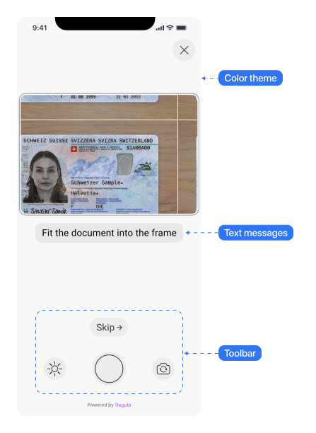
- Colors and theme. You can customize colors, themes, and interface icons. Changes to colors and themes can affect color contrast and the visibility of interface elements (Perceivable). Keep text contrast, and do not rely on color alone to convey status. See Color Theme for the Mobile SDK and CSS Parts for Web Components.
- Text and messages. You can customize the presentation and content of interface messages, including status, capture guidance, error messages, and localization. Changes to text presentation and localization can affect readability and message clarity (Perceivable, Understandable). Keep messages short and specific, and make sure translations convey the same meaning as the original. See Messages for the Mobile SDK and Localization for Web Components.
- Buttons, icons, and custom UI elements. Customization can include buttons, images, icons, and other interface elements. If you build your own interface, its accessibility depends on your implementation (Operable, Robust). Provide accessible names for icon-only buttons, and make sure every control can be used with a screen reader and other assistive input methods. See Custom Layer for the Mobile SDK and the Advanced Configuration for Web Components.